2014 Colour Trends
Pantone have chosen some fantastic colours for you for 2014, however if the colour chart above just isn't inspiring you enough, I have scoured the Internet for pictures to give you that little extra...
PANTONE: Cayenne.
I've been seeing this colour slowly sneak into our lives in the past year, and boy am I glad it did, I just can't get enough of this colour!
PANTONE: Dazzling Blue.
Reminds me of Royal Blue, with more Jazz. Think, feature walls. Think, statement pieces. Think, Dazzling Blue.
PANTONE: Paloma.
Possibly my favourite out of all the colours this year, but that's only because I'm a sucker for Grey tones. Team Paloma with any of the other colours and you'll have a match made in heaven. Beautiful.
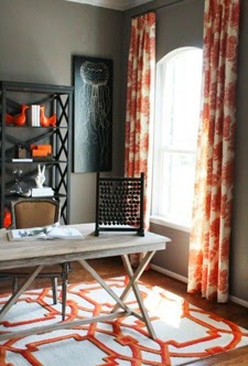
PANTONE: Celosia Orange.
Throw away everything that made you dislike Orange because Celosia Orange is here to win your heart. Are you in love yet?
PANTONE: Hemlock.
You really can't go wrong with Hemlock, whether your wearing it or painting it on your wall, it's a safe, comfortable, reassuring colour. Hemlock will be your best friend this year.
PANTONE: Sand.
Sand with White. Perfection. If you're a lover of the neutrals, like me, Sand is a perfect alternative. A little deeper than the usual beige, but equally as relaxing and comforting.
PANTONE: Freesia
You just can't deny it, Freesia is a happiness in one pot. Paint anything this colour for an instant boost.
PANTONE: Radiant Orchid.
Pantone's 2014 Colour of the Year and what's not to love! It's bright and yet not too "in your face", it's uplifting and yet still relaxing... It's just radiant. Radiant Orchid to be precise. I suspect you'll be seeing a lot more of this colour, everywhere!
PANTONE: Placid Blue.
No colour chart would be right without it's light blue tones, and I like this one. Even the name reminds you that you should be relaxing with it on your walls, "placid blue"... I'm feeling mellowed already.
PANTONE: Violet Tulip.
Cute, delicate and pretty. Paint anything this colour for the instant "aw, so cute" effect, in fact lets just paint everything in this colour. I think the world would be a better place if everything was Violet Tulip.